Gateway Fire Supplies
Identity, Web Design
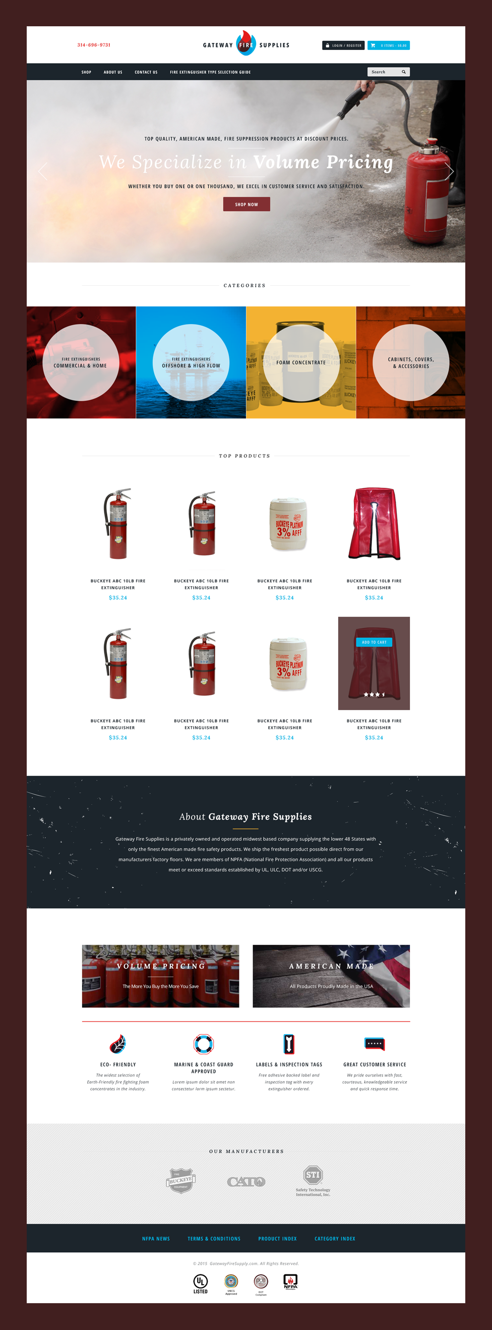
While developing the identity for Gateway Fire Supplies, the owners expressed their desire for something that would stand out from the competition without feeling disjointed. I incorporated colors from a mid-century palette, to accommodate the owners' personal tastes, and used a minimal amount of flame imagery that was ubiquitous amongst their competitor's websites. The result was unique and a little quirky, while ensuring trust and professionalism.


